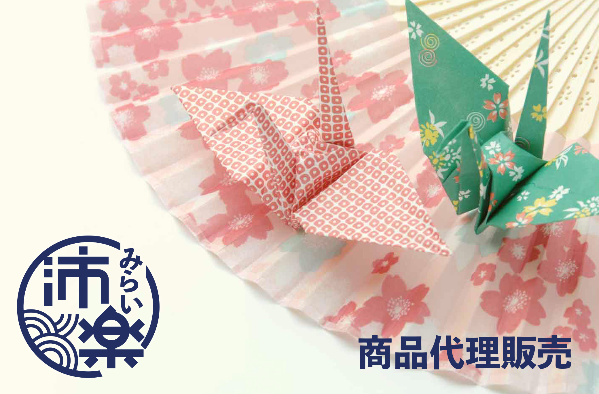
Japanese Traditional Sentiment Design
As Hairaku is a brand specializing in gift sales, design inspiration comes from the Japanese gift envelope “go-shu-gi-bu-ku-ro” 「ご祝儀袋」(go-shu-gi-bu-ku-ro)and the knot in the middle called “mi-zu-bi-ki”「水引」(mi-zu-bi-ki)The knot is used as a visual element to complete this logo design.


Main color is indigo blue paired with off-white,
and with the addition of Chinese characters,
it enhances the Japanese feel and makes the layout of the pattern
convenient for displaying brand information in different places,
increasing the application level of the brand’s visual identity,
deepening people’s understanding and increasing business opportunities.

